
Yep, I finally got around to finishing it! To be honest, going to Marietta actually helped. I had a vague idea of what I wanted in the background (as you might have been able to tell from the line art), but after going to a small river town, that really stuck with me. The result:
Popsicle by ~Kitsune64 on deviantART
I tried out a few different things with the background, among them custom brushes and textures. Some worked well, some... not so well. Still, I like the overall picture, even if I still haven't quite gotten the hang of rendering a "painterly" background.
Plus, I managed to get a pic up for August. How an entire month went by without me posting a single pic in my deviantArt gallery is beyond me. Oo;; I'm just glad I noticed before September 1st!
Showing posts with label art. Show all posts
Showing posts with label art. Show all posts
Tuesday, August 31, 2010
Saturday, August 21, 2010
Kit and Coptic Binding
New skill is go!
After a trial run with a card stock cover and ordinary type paper, I've created my first hard cover journal/sketchbook!

It measures in at approximately 4 1/2 x 6", with 120 pages. I used one of my favorite pics, Terry in Flight, for the main image on the cover. Yeah, it's a little old (it was done in '06), but it's still one of my favorites. Behind that, the top image is an old map found in the Wikimedia Commons. Seeing as it was an OLD map, it was in the public domain, and thus free to be used as a backdrop. Below that, I simply gathered together a bunch of quotes that relate to creativity, imagination, and whatnot. They create a sort of visual white noise, set the mood for the journal, and are ones the resonate personally with me. Rather than assemble it collage-style, I went ahead and put it together in Photoshop and printed out the final product.
 In almost all the Coptic-bound books I've seen, the spine is open. Either this is to show off the artistry of the stitch, or it's really difficult to do a cover over the spine. In my trial run, I used three rows of stitches, which worked fine, but I wanted something a little more... secure-feeling, so this one's got five. For the cover, I hunted down the backing from an old calendar - you know, the cardboard inserts the manufacturer sticks in to keep it from horribly deforming during the shrink wrap process? Well, not all of them are normal cardboard. Some of them are a really rather nice variety. I snagged some of that (See? Never know what you'll need later!), and with the reinforcement of the Mod Podge, it's turned into a really nice hard cover.
 For the paper, I pillaged an old, mostly unused sketchbook for some 50lb sketch paper. Now, the really nice thing about Coptic binding is that it has the ability to lay flat on just about any page without needing a wire spiraling through it. I wouldn't suggest pinching the covers together and waving it like a fan or anything, but the binding does seem to be pretty secure, even if there is a little more movement than I'm used to in a journal.
 For the thread, I used embroidery floss, whittled down to three strands and then braided. I haven't done any strength tests on embroidery floss lately, so braiding it together gives it a little more strength and security. Color-wise, the top contenders were blue and brown. Blue won out - it picks up the color in his hat and the text better.
 About the only problem I'm having so far is that the first and last rows - the rows where one signature of paper is attached to the next - don't quite look right. I'm using a "one needle" technique, so maybe that's it. That, or I'm not doing something right. If any of you have any idea what I'm doing wrong there, please do let me know!
Overall, I'm pretty happy with my little journal/sketchbook! I'll be keeping this one.
After a trial run with a card stock cover and ordinary type paper, I've created my first hard cover journal/sketchbook!

It measures in at approximately 4 1/2 x 6", with 120 pages. I used one of my favorite pics, Terry in Flight, for the main image on the cover. Yeah, it's a little old (it was done in '06), but it's still one of my favorites. Behind that, the top image is an old map found in the Wikimedia Commons. Seeing as it was an OLD map, it was in the public domain, and thus free to be used as a backdrop. Below that, I simply gathered together a bunch of quotes that relate to creativity, imagination, and whatnot. They create a sort of visual white noise, set the mood for the journal, and are ones the resonate personally with me. Rather than assemble it collage-style, I went ahead and put it together in Photoshop and printed out the final product.
 In almost all the Coptic-bound books I've seen, the spine is open. Either this is to show off the artistry of the stitch, or it's really difficult to do a cover over the spine. In my trial run, I used three rows of stitches, which worked fine, but I wanted something a little more... secure-feeling, so this one's got five. For the cover, I hunted down the backing from an old calendar - you know, the cardboard inserts the manufacturer sticks in to keep it from horribly deforming during the shrink wrap process? Well, not all of them are normal cardboard. Some of them are a really rather nice variety. I snagged some of that (See? Never know what you'll need later!), and with the reinforcement of the Mod Podge, it's turned into a really nice hard cover.
 For the paper, I pillaged an old, mostly unused sketchbook for some 50lb sketch paper. Now, the really nice thing about Coptic binding is that it has the ability to lay flat on just about any page without needing a wire spiraling through it. I wouldn't suggest pinching the covers together and waving it like a fan or anything, but the binding does seem to be pretty secure, even if there is a little more movement than I'm used to in a journal.
 For the thread, I used embroidery floss, whittled down to three strands and then braided. I haven't done any strength tests on embroidery floss lately, so braiding it together gives it a little more strength and security. Color-wise, the top contenders were blue and brown. Blue won out - it picks up the color in his hat and the text better.
  About the only problem I'm having so far is that the first and last rows - the rows where one signature of paper is attached to the next - don't quite look right. I'm using a "one needle" technique, so maybe that's it. That, or I'm not doing something right. If any of you have any idea what I'm doing wrong there, please do let me know!
Overall, I'm pretty happy with my little journal/sketchbook! I'll be keeping this one.
Thursday, August 5, 2010
Eye Practice, Part II
And the practice continues... I wasn't happy with the first eye, so... I completely redid it.

I'm much happier with this one, as you might have guessed by the fact that I did two eyes, one with warm shading and one with cool. Yep, just for the practice, which I think is definitely helping. I decided to change the eye shape a bit, refine the eyebrow so it doesn't look so pixelated, and work on the textures. The shadows might be a little too dark, but I haven't decided if I want to do anything about that or just leave it alone for now.
 I have actually finished the entire face by now, so here's just a small peek at that. The proportions may be a little off still, but it's still a big step for me, and I think those proportions a a little closer to realism than my last attempt. Don't get me wrong; I still love how she turned out, but it's still not exactly realistic. This one's yet another step closer.
Of course, the next challenge is the hair... Attempts #1 and 2 have not gone well. Hopefully third time's the charm!

I'm much happier with this one, as you might have guessed by the fact that I did two eyes, one with warm shading and one with cool. Yep, just for the practice, which I think is definitely helping. I decided to change the eye shape a bit, refine the eyebrow so it doesn't look so pixelated, and work on the textures. The shadows might be a little too dark, but I haven't decided if I want to do anything about that or just leave it alone for now.
 I have actually finished the entire face by now, so here's just a small peek at that. The proportions may be a little off still, but it's still a big step for me, and I think those proportions a a little closer to realism than my last attempt. Don't get me wrong; I still love how she turned out, but it's still not exactly realistic. This one's yet another step closer.
 Of course, the next challenge is the hair... Attempts #1 and 2 have not gone well. Hopefully third time's the charm!
Monday, August 2, 2010
Eye Practice
Yesterday, I got my hands on Impact Publishing's "Fantasy Art," which they term a "bookazine" because it is over 200 pages and probably only got stuck on the magazine rack because it's Volume 1 and bound like a nice magazine and because the creators couldn't even decide on what it was (alas, that means it's exempt from most coupons). Plus, it comes with a CD with video tutorials, brushes, and reference images. Haven't gotten into them yet, but yay, references!
In any case, it's chock-full of tutorials and helpful hints on everything from painting portraits to designing architecture. Every now and then, I like to try something a little more realistic than my normal anime style, so when I saw the tutorial on digitally painting eyes, I decided to put the Popsicle pic on hold and give it a try.
This is what I've got so far:

Still not quite as realistic as I'd like, but not too bad. The eyebrow needs some serious help, as well as those lower eyelashes, but overall, I think it's a step in the right direction. And yeah, went for a red eye (can't completely purge my fantasy tendencies!). Now, back to your regularly scheduled programming...
Sunday, August 1, 2010
Popsicle Process
 Yep, didn't exactly get it finished yesterday - an impromptu round of WoW with the brother and sister-in-law demanded my attention. Several hours of traipsing through the Barrens later, and it was back to work.
In any case, the lines are done and the base colors are all set on the girl. Which means it's time to start on the background. I'm going for more of a city scene. Or, at least, a town. Not something I do a whole lot, but practice is a good thing. Little trellis thing will hopefully be a cafe, and the further background will be done sans-lines, I think. Stick some city-bound foliage in there... I don't want the background to dominate or compete with the girl for attention.
Coloring this is going to be... interesting, to say the least. We'll see how it goes!
Saturday, July 31, 2010
Home Improvements
This has been an interesting month. Terrible for blogging and doing anything productive, online-wise, but still interesting. We're in the process of making a few home improvements - specifically, new vanity tops in the bathrooms and, for the big one, new floors through much of the ground floor. Seeing as I'm from a family of packrats and clutterbugs, this means a LOT of packing things up to relocate them during the installation.
Exactly HOW I fit so much stuff into such tiny spaces, I do not know. I'll have to take some pictures.
 Anyways, my goal for today is to get one more finished pic up in my deviantArt gallery, so I snagged one from a recent sketch session to try and get that done. If not, I'll have a fresh pic for August, then.
I figured this one was a nice, summery one. Girl eating a Popsicle - nice variation from the typical girl-in-a-bikini pics that usually show up when someone wants to do something summer-like. It's half-inked right now... and outlining in Photoshop takes forever, but it gives me a smoother line than in MangaStudio. I'm still not sure what I'll put in the background, but we'll see what shows up!
Okay, back to work!
Exactly HOW I fit so much stuff into such tiny spaces, I do not know. I'll have to take some pictures.
 Anyways, my goal for today is to get one more finished pic up in my deviantArt gallery, so I snagged one from a recent sketch session to try and get that done. If not, I'll have a fresh pic for August, then.
 I figured this one was a nice, summery one. Girl eating a Popsicle - nice variation from the typical girl-in-a-bikini pics that usually show up when someone wants to do something summer-like. It's half-inked right now... and outlining in Photoshop takes forever, but it gives me a smoother line than in MangaStudio. I'm still not sure what I'll put in the background, but we'll see what shows up!
Okay, back to work!
Thursday, May 27, 2010
Art Blog: James Gurney
On my list of Things That Inspire Me, the work of other artists is pretty darn near the top. The way they compose a scene, how they incorporate characters, how they create backgrounds and moods and so much more can all spur me on to try out a new technique in my own work or drive me to improve overall. And, of course, I have some sort of obsession looking at other artists' sketches and their processes, but from what I've seen, that's pretty common among art people.
In any case, one artist whose work has inspired me for years is James Gurney. Yep, the guy who does the Dinotopia books. I have a well-loved copy of Dinotopia: The World Beneath that I loved to flip through and study the paintings in. I recently discovered that he has done a lot more extensive work for everything from book covers to National Geographic illustrations.
Even better... he has a blog.
This guy posts pretty much every day (and occasionally, more than once!), and Gurney Journey is just bursting with tips, explanations, and inspirations for artists. If you're an art student or just want to improve your work, you seriously have to check this out. You never know what you'll learn.
Friday, April 23, 2010
Textures
There is one part of digital art that I've never really utilized as much as I could: textures. One reason for it is that, badly done, pictures can look really bad when textures aren't used right. And believe me, a lot of artists don't use textures well, so I'd always been a little turned off on using them, save for certain circumstances - making something look like it was done on old paper, for example, like in my Medan series.
Then, I started picking up ImagineFX Magazine, which is possibly the most helpful and inspiring digital art magazine I've ever had the pleasure of reading. A little on the pricey side, but well worth it. Anyways, one of the issues from a few months back had a walk-through on a steampunk piece that not only had an interesting way of shading, but proved that well done, an artist can use textures not have it look natural, like a part of the art rather than a photoshopped mess.
Of course, this led me to want to try it... which led to my second problem: finding royalty-free textures, preferably for free, without spending days scouring my home town with my digital camera in hand.
The solution came from a friend of mine who had no idea I'd even been considering doing this: CGTexture.com. A lovely database full of free-to-use textures and royalty-free photos, all perfect for the digital artist. All neatly organized, too. You do have to sign up for an account, but they have a free version. The only catch is that you may only download 15 MB within a 24 hour period, but considering the variety of file sizes available for each texture, I haven't even come close to reaching that limit.
Oh, and no using the textures for scrapbooking purposes. They're very clear on that.
Anyways, whether or not my texture experiment ever sees the light of the internet remains to be seen, but I won't get any better if I don't try, right? Right!
Monday, April 12, 2010
The Great Cleaning of 2010

Twice a year, my subdivision gives people an extra incentive to go on a major cleaning spree: an all pick-up trash day. The spring cleaning one was today, which means I spent a large chunk of my weekend - you guessed it - cleaning. The focus this time was on my room, namely clearing it out enough that one can actually walk from one side of the bed rather than climbing over it.
Mission: success! Cleared out plenty of junk, reorganized things into a more orderly fashion, and even sent a few bags of clothes off to Goodwill.
Of course, Spring Cleaning isn't quite finished yet. Up next is the Great Dusting of 2010, also known as the Culling of the Dustbunnies. It may require a mask - at the very least, open windows. The abnormality in space and time known as my closet will have to wait, I think, until the September all pick-up, lest its contents once again overwhelm my room and all adjoining spaces.
Sunday, March 28, 2010
Manga Studio EX 4.0
Well, it finally arrived, and one thing is for sure: it's going to take quite a bit of poking around to figure everything out! Oh, sure, the basic set-up's the same, and all the regular tools seem to be in place, if not under the same icons, but there are a few key differences, like in how the stories are set up and a few of the finer points of the tools.
And there are quite a few new features for me to play with. I'm particularly excited about the color feature. Not that I'm expecting anything to rival Photoshop, but who knows? I might be pleasantly surprised. It should be interesting, at the very least.
The next page of Strawberry Syrup may still be done on the old laptop, though, if not the rest of Chapter 4. It depends on if MS 4 has problems with the story set-up of MS 3. We'll see how the poking around goes.
Tuesday, March 23, 2010
Postal Delays
No comic this week. Alas, my upgraded Windows 7-compatible version of Manga Studio hasn't arrived yet. Sure, I could do it on my old laptop, but there's a whole hassle with transferring and all that fun stuff, so I'd rather just wait. This is what I get for ordering a hard copy.
I did, however, finish up Mariposa with an easy background, so she kinda looks like a trading card or something. You can see the finished version over at my deviantArt gallery. I think she turned out pretty well. ^_^
It is going to be so nice to get that upgrade. I want to do some sketching.
I did, however, finish up Mariposa with an easy background, so she kinda looks like a trading card or something. You can see the finished version over at my deviantArt gallery. I think she turned out pretty well. ^_^
It is going to be so nice to get that upgrade. I want to do some sketching.
Saturday, March 20, 2010
Character Design: Mariposa
Alright, so sometimes in the course of my chat!RPs, the question comes up of what the kid of two characters would look like. I, of course, love it when this happens. It's like a special treat for the character designer in me: try to create a character that incorporates traits of two others in some way. Hello, playland!
This hasn't happened in awhile, alas - I think the last time was with Bridget back in 2008 - but one of my frequent RPmates brought up a potential kid the other night, and of course, I had to give it a shot. For now, I'm calling her Mariposa:

Mariposa here does not have a chance of existing short of the magical equivalent of the mother of all drunken one-night stands, but man if she wasn't fun to figure out. Pretty much the only things the other RPer suggested were that the kid be stunning and dark featured, so I got to play a lot with her.
Plus, I had an excuse to do something more in my usual style on the new laptop. Granted, since I don't currently have a working copy of MangaStudio that exports, I had to do it ALL in Photoshop, including the sketch and the line art. Normally, I do all that in MangaStudio because the MangaStudio pencil tool rocks for sketching, and the pen tool in beautifully easy to use. Outlining in Photoshop in comparison is SO incredibly tedious.
Anyways, I'll probably figure out a simple background once I know more about Mariposa here and then throw her up on dA. Good times.
Thursday, March 18, 2010
Pressure Sensitivity Problems Solved!
Sorta. Turns out Manga Studio 3.0 is nooooot quite compatible with Vista or Windows 7: the pressure sensitivity just does not work. After spending some time checking out help forums and whatnot, my brother finally suggested we try the demo for Manga Studio 4 to see if it was still a problem them... and lo and behold, pressure sensitivity was fine.
Fortunately, it's just an upgrade, so it cost me $130-something instead of $300. Oi.
Anyways, I opted for a physical copy this time (my last copy was a download), so I've got a little time before it arrives. Alas, I found out AFTER that that the demo doesn't allow you to export. In the mean time, I decided to make sure Photoshop wasn't having any problems and did a quick little experiment in a different style than usual:

Not my best work. I was trying for something. Didn't quite get it. But I'm actually happy with the lips for once, so that earns him a posting somewhere. Basically, I wanted to do something where I could use a few different brushes, do some smudging and blending, and not spend a WHOLE lot of time on it. Character's name is Erich, btw... older brother of one of my RP characters, hence the unusual hair color. I dunno, I've just never liked drawing completely random characters. Gotta have some sort of story there.
Wednesday, January 20, 2010
WIP: In the Office
Alrighty, this is from my queue of Works In Progress:
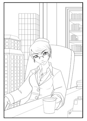
This is a minor character who might be showing up in my chat!RP, but I got the image in my head and had to draw it... and then it turned into an exercise in perspective and whatnot. Exercises are good for me, and perspective is one of those things I usually have to force myself to do. Continuing with the exercise idea, there are a few things I'm thinking about trying when I get around to coloring it. Hopefully it'll turn out well!
Sketch and line art were both done in Manga Studio EX. Have I mentioned how much I love their perspective ruler? It gives a digital version of a horizon line with up to three vanishing points, and - here's the important part - it lets you have the vanishing points OFF the page. You have no idea how helpful that is. Trying that in Photoshop leads to copious headdesking.
Monday, January 18, 2010
Eros and Anteros
Last week, I finished the Valentine Fairy pic and posted it up on my deviantArt page, where one of my frequent visitors asked if she had "plumed" butterfly wings. Thinking I was sorely uneducated in butterfly terminology, I asked what, exactly, plumed butterfly wings were. Turns out, they're the feathered butterfly wings of Eros's little brother, Anteros. Being the mythology nut I am, of course I had to plunge right into researching the guy... and then, I had to draw him.
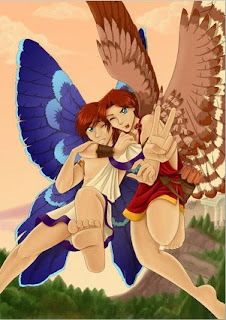
Eros, little attention whore that he is, insisted on hopping in, too.
In any case, this took three straight days from sketch to posting, which translates to maybe 24-30 hours of work. I'm pretty happy with it. For once, I think I've managed a background that is present but supports the composition of the picture as a whole rather than going, "Look at me! Look at me!" There's a nice, warm atmosphere to it all, and the peachy color scheme really helps Anteros's wings and their eyes stand out, but not jarringly so.
As for those wings... For Anteros, I spent awhile trying to figure out just how one feathers butterfly wings and still has them functional. In the end, just feathering the basic butterfly structure seemed the way to go. That lovely blue comes from a passage on the Erotes from Philostatus the Elder over at The Theoi Project, where he described them as having deep blue, purple, or golden wings. Blue seemed to suit Anteros, with him being the personification of mutual or returned love: soothing, calm, and beautiful.
Meanwhile, his big brother Eros started out with the typical white dove wings, but next to Anteros, they just seemed so bland, and didn't really pop enough in the picture. They needed something more... so I bit the bullet, pulled out the lasso tool, and turned his wings into a hawk's. He's a little more predatory and arrow-happy in nature, so that seemed like a good fit for him.
Now, I know that somewhere out there, there is someone going, "But I thought they were supposed to be chubby cherubs with a head full of golden curls!" Well... artistic license here. I've never really been comfortable with Eros/Cupid being all child-like, especially in the context of the Eros and Psyche myth. I'm far more comfortable with them being attractive adult males. I did intend them as blonds when I started, but it just did not work out. But I think auburn works wonderfully for the two of them.
Overall, I am really happy with this piece. I kinda wish I'd done a step-by-step as I went along. Maybe next time!
Monday, December 21, 2009
2009 Summary Meme
As I was finally going through the massive pile of deviations stacking up in my devArt inbox, I stumbled across a new meme: the 2009 Summary Meme. I think I'm actually going to do this one. I mean, what better way to end the year than to sit back and take stock of everything you've done over the past 12 months?
It helps that for once, I had pretty decent artwork every single month. In fact, for the first couple months, I'm going to have a hard time picking. In March, for example, we had both The Centaur Kiraz and Attempt 02, my second attempt at drawing one of my DI characters in a realistic style (namely Astarte, who turned out rather fantastically). At the moment, I'm leaning more towards Astarte, but I am still hella proud of how Kiraz turned out, too. And let's not even get started on February...
Also as an end-of-year type thing, I'm working on a another doodle page, done on the old paper again. Why? Because that's how I started the year. It should be an interesting comparison, seeing how my style has changed over the year, assuming it has at all. Considering my so-called "style" seems to be in flux from one piece to another, it would be a miracle if it hasn't.
Here's a sneak preview from the doodle page:

Yeah, there's more than a few *ahem* character interaction exercises on this sheet. I've got about a week to finish coloring things in, which I will get right back to as soon as I get something done for Strawberry Syrup this week. It's Christmas - gotta do something!
Wednesday, December 2, 2009
December, December...
I've always liked the month of December. After years of an annual Christmas play and handbell choir in grade school and junior high, I've got a strong affinity for Christmas songs. Granted, I'm not one of those people who wants Jingle Bells blasting in the car from November to New Years, but I love them enough to devote an entire lens to My Favorite Christmas Songs. I also get to set up the family Dickens' Village, and the Christmas tree goes up around Thanksgiving so we can enjoy it all through December. All we really need now is snow.
This year has been pretty devoid of snow in my area. Scratch that - completely devoid of snow. I don't think we've had so much as a threat of the fluffy white stuff this year. Still, I was in the mood to do something cute and snow-related for about a month now, so I finally sat down and did it:
Yep. The Kitsune Snow Day. I occasionally do cute things like this - mostly when I have younger cousins sitting right next to me and demanding I show them how to draw something. Or just quietly sitting and watching my every move, which makes me acutely aware that they are under 10 years old and drawing hot guys is not appropriate. That would be how the animals for the Pink Ballerina Box came about.
The Kitsune Snow Day, however, was all for me. I had the image of two cute little foxes building a snowfox, and hey, I like foxes, so went ahead and indulged my "Awwwww so KYOOT!" side. Besides, doing more than one style is good for you, I hear.
This one was done entirely in Photoshop. No preliminary sketches this time!
This year has been pretty devoid of snow in my area. Scratch that - completely devoid of snow. I don't think we've had so much as a threat of the fluffy white stuff this year. Still, I was in the mood to do something cute and snow-related for about a month now, so I finally sat down and did it:

Yep. The Kitsune Snow Day. I occasionally do cute things like this - mostly when I have younger cousins sitting right next to me and demanding I show them how to draw something. Or just quietly sitting and watching my every move, which makes me acutely aware that they are under 10 years old and drawing hot guys is not appropriate. That would be how the animals for the Pink Ballerina Box came about.
The Kitsune Snow Day, however, was all for me. I had the image of two cute little foxes building a snowfox, and hey, I like foxes, so went ahead and indulged my "Awwwww so KYOOT!" side. Besides, doing more than one style is good for you, I hear.
This one was done entirely in Photoshop. No preliminary sketches this time!
Wednesday, October 28, 2009
The Meaning of Halloween
I love the Halloween season. Sure, my trick-or-treating years are long since passed and there isn't exactly a load of party invites in my inbox, but there are plenty of great things still - a month's worth of horror movies, an open bowl of all my favorite fun-sized candy bars in the kitchen, and the chance to draw some of my characters in ridiculous outfits.
Of course, one of my favorite things is doing the Strawberry Syrup Halloween splash page. I know, I know, it breaks up the comic and I've already had enough filler this year, but it's Halloween. Halloween, and a webcomic about vampires and weredogs. I'm practically required to do something for it.
In 2007, I did a nice little role reversal between Hunter and Sammy - Sammy van Helsing and Count Huntula. For 2008, it was a flash to the past with Missy and Hunter's adventures in trick-or-treating. And for this year...
Ferdy, as the Headless Horseman. Which was a fantastically fun piece to do, and probably the happiest Headless Horseman you'll ever see.
Obviously, a little late to add it to the store - I believe Halloween merchandise is supposed to go up in late September - but it'll be there for next year... once I figure out what I'm doing with the Strawberry Syrup shop, anyway. I still haven't decided if I'm going to keep it as just a category or give it its very own shop now that I'm moving to Zazzle. It's nice to have the option.
Speaking of timing, the passing of Halloween means one more thing: time to start getting those Christmas designs up and ready for sale! I'd better get busy...
Of course, one of my favorite things is doing the Strawberry Syrup Halloween splash page. I know, I know, it breaks up the comic and I've already had enough filler this year, but it's Halloween. Halloween, and a webcomic about vampires and weredogs. I'm practically required to do something for it.
In 2007, I did a nice little role reversal between Hunter and Sammy - Sammy van Helsing and Count Huntula. For 2008, it was a flash to the past with Missy and Hunter's adventures in trick-or-treating. And for this year...

Ferdy, as the Headless Horseman. Which was a fantastically fun piece to do, and probably the happiest Headless Horseman you'll ever see.
Obviously, a little late to add it to the store - I believe Halloween merchandise is supposed to go up in late September - but it'll be there for next year... once I figure out what I'm doing with the Strawberry Syrup shop, anyway. I still haven't decided if I'm going to keep it as just a category or give it its very own shop now that I'm moving to Zazzle. It's nice to have the option.
Speaking of timing, the passing of Halloween means one more thing: time to start getting those Christmas designs up and ready for sale! I'd better get busy...
Subscribe to:
Posts (Atom)


