
There is one part of digital art that I've never really utilized as much as I could: textures. One reason for it is that, badly done, pictures can look really bad when textures aren't used right. And believe me, a lot of artists don't use textures well, so I'd always been a little turned off on using them, save for certain circumstances - making something look like it was done on old paper, for example, like in my Medan series.
Then, I started picking up ImagineFX Magazine, which is possibly the most helpful and inspiring digital art magazine I've ever had the pleasure of reading. A little on the pricey side, but well worth it. Anyways, one of the issues from a few months back had a walk-through on a steampunk piece that not only had an interesting way of shading, but proved that well done, an artist can use textures not have it look natural, like a part of the art rather than a photoshopped mess.
Of course, this led me to want to try it... which led to my second problem: finding royalty-free textures, preferably for free, without spending days scouring my home town with my digital camera in hand.
The solution came from a friend of mine who had no idea I'd even been considering doing this: CGTexture.com. A lovely database full of free-to-use textures and royalty-free photos, all perfect for the digital artist. All neatly organized, too. You do have to sign up for an account, but they have a free version. The only catch is that you may only download 15 MB within a 24 hour period, but considering the variety of file sizes available for each texture, I haven't even come close to reaching that limit.
Oh, and no using the textures for scrapbooking purposes. They're very clear on that.
Anyways, whether or not my texture experiment ever sees the light of the internet remains to be seen, but I won't get any better if I don't try, right? Right!
Showing posts with label tips. Show all posts
Showing posts with label tips. Show all posts
Friday, April 23, 2010
Wednesday, April 7, 2010
The Comic Process, Part II: The Lines
After the Thumbnail, it's time to put the actual page together. For you familiar with the Western comics way, it's the pencils and inks. Because there really isn't much of a difference in appearance between the two, I'm just going to show you the inked version:
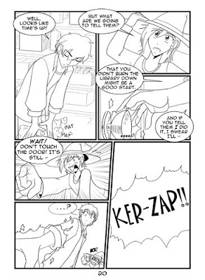
As you can see, nice clean lines, dialogue bubbles in place, black shadows added... Basically, this is how the page looks before I export it into Photoshop for the shading. If this were a print comic, I'd do screen tones in Manga Studio, but since Strawberry Syrup is a webcomic, I prefer to work in solid grays, and I tend to find it easier to do in Photoshop.
That, and I resize and crop the pages a bit - much easier in Photoshop.
Anyways, pay special attention to the panel where Hunter's about to grab the shiny glowing doorknob. In the thumbnail, you'll notice that there were originally two panels there. I decided that I really only needed one. The emphasis is now on his hand, rather than the hand shot just being glossed over by the eye.
Next time: the finishing touches!
Tuesday, March 9, 2010
The Comic Process, Part I: The Thumbnail
Alright, so by now you're well aware that I have a weekly (heh, supposedly) webcomic, Strawberry Syrup. Here's how I come up with each page.
First up: the Thumbnail.
A thumbnail is basically a very quick sketch meant to help me figure out what elements I want on the page and where to put them. By 'very quick,' I mean no time spent on detail. Here's the thumbnail for Page 20 of Chapter 4:

As you can see, very quick, very sketchy, and not exactly an architectural blueprint here. There are three key things I need out of my thumbnails. 1) Where are the panels going? 2) Who's in each panel and what position are they in? 3) Where are the speech bubbles going? It doesn't take a whole lot of detail for me to tell any of those things, especially when most characters have some identifying characteristic. Dwayne's got his big ol' wizard's hat, Sammy's got glasses, Ferdy's got his cape... Not real hard to tell them apart.
Now, here's the important part: the thumbnail can change. They're not set in stone, and I'm allowed to change them, as you will see in Part II. By sketching it out nice and fast, I can see how it does or doesn't work, how another panel arrangement might work better, and what content might work better in each panel. If I weren't lazy or on a weekly schedule, I'd probably sketch out those variations, too, and pick which one looks best.
As it is, I thumbnail once, then wing it. Do not follow Kit's example there, kids. Ideally, you'll have each chapter thumbnailed well in advance. Trust me, it's easier that way.
Friday, February 26, 2010
Breaking Down the Roadblock
Operation Roadmapping: Success!
It probably sounds like the dullest and least creative thing ever, but outlining the story thus far and then making a little chart with the events for each major plotline actually helped a lot.
Yes, I made a chart. I get all analytical like that sometimes.
Anyways, by charting the plotlines in separate columns and then using a different row for each day of the week, I could visually see whether my plots were balanced enough and what needs to happen next - which was the whole point. Even if I eventually change things around (which, given the nature of rewriting, I probably will), for now at least I can get moving again.
... Which I'm going to go do now! :D
Monday, November 23, 2009
D'oh!
Alright, so I was looking through my Squidoo lenses, as I often do in the quest to keep them updated and their lens rankings below 100K. Good thing I did, too. Apparently, last time I'd updated my Urban Fantasy lens, I'd suffered an epic brain fart or been distracted by something suitably shiny, because I had a whole brand new section I didn't remember publishing: What Makes a Great Urban Fantasy Series, According to the Personal Preferences of Kit.
That would be all well and good. In fact, it was something I'd planned on for awhile. There was just one problem... All it said was, "There is a lot of urban fantasy out there. Some of it's good, some's not so good, and some earns a spot on the shelf by my bed where I can easily read and reread it over and over again. What makes those chosen few series stand out among the masses?"
... Yeah. That was it. So, Kit, what DOES make a series stand out among the masses? HA! Not telling! Take that!
*headdesk*
Hopefully, it wasn't like that for too terribly long, but it has now been fixed. So what makes a series stand out to me?
Basically, I like a gripping plot with a main character that I actually LIKE and a good sense of humor to balance out the "omg HOW WILL THEY EVER MAKE IT?!" of the tension. (For a more in-depth explanation, read the lens.)
This pretty much spreads to all the genres I read. At some point, I'll have to go through my personal pet peeves, but that's a topic for another post. The lesson here is for all the little Squidooers out there: Make sure to actually READ your lens once in awhile, and not in the workshop - the actual lens. It'll help you catch little things like unfinished modules that have been making your readers wonder what malfunction's going on in your brain.
Subscribe to:
Posts (Atom)


